Saturday, December 8, 2007

More from November

My show at Modern Masters Fine Art in Palm Desert went really well, and I thank those hardy friends and family members who trekked out from L.A. to take it in.


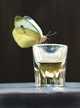
Paul Pitsker, Erasing [detail], 2007, watercolor, 20 x 15 in.

You can read more about the hot contemporary art scene in Palm Desert in Art and Antiques, if you're curious...

One highlight from the trip I have to mention was our stop at the Wheel Inn in Cabazon. Perhaps, like me, you have driven past those landmark larger-than-life dinosaurs on the 10 freeway a bizillion times without stopping -- or, even if you haven't, you may recall them from PeeWee's Big Adventure. Well, the restaurant at their feet (more or less) is so worth a visit -- at least, for an early morning breakfast it was a dream. From the vintage beaded light fixtures, to the ubiquitous steer horns and scrolling aquarium motion lamps, to the 100% rayon leopard-print shirts worn by the staff, to the petrified prospector and his mule greeting you out front, this place is the real deal -- a genuine living museum of time-warped roadside kitsch Americana. Check it out before it is lost to the outlet-center corporate franchise sprawl and tribal casino mega-development swallowing up the desert all around it.


In other news...

I see a lot of art around town but rarely get the chance to sit down and write about it. But here are some hightlights from my Saturday rounds in November...


Rico LeBrun at Koplin del Rio

I remember being greeted by the flayed and tormented figures in Rico LeBrun's Genesis as I exited my college dining hall three times daily way back in the previous century, or thereabouts. Of all the chaos and suffering depicted in that mural, I was most haunted by the figure of Job heaving his massive, crippled carcass on a rough-hewn crutch while grimacing bitterly up at the heavens. The cycle of LeBrun drawings currently showing at Koplin del Rio may be less overtly stomach-churning, but it offers no less fascinating glimpses into the process of an artist for whom drawing was clearly the preferred vehicle of offroad exploration into the darker thickets of his own psyche. While inspired by Dante's Inferno, these are not literal book illustrations. It is instead the broader horror arising from LeBrun's contemplation of eternal torment in infernal darkness that seems to have inspired these rapidly executed and expressive drawings. Their fluid gestural lines and ink washes describe intertwining figures and body parts that don't always resolve coherently but rather suggest interwoven, often symmetrical mandalas of human suffering.


Leigh Salgado at Avenue 50 Studios

I confess I looked at Leigh Salgado's recent work at Ave 50 Studios for quite some time (okay, minutes) before I realized the fragments of printed text embedded among her meticulously cut paper layers were hardly fragmentary at all when read backwords word by word. Oh, it's poetry, I thought in my distracted dullitude. It took me an embarassingly longer time to realize these were actually the remnants of player piano scrolls with song lyrics printed on them. My thoughts jumped immediately to Conlon Nancarrow, laboriously cutting his intricate and unplayable polyrhythms onto custom piano rolls in the mid-twentieth century. Salgado's work is no less intricate and laborious. Armed with an x-acto knife and a sharpie, she transforms ordinary paper into layers of complex patterns and textures resembling delicate lace, fishnet stockings, sensuous flesh, and lyrical abstraction, complemented nicely by the correspondingly complex shadows these works cast on the wall.


Tom Chambers at George Billis

Tom Chambers' beautifully staged color photographs at George Billis gallery call to mind Pre-Raphaelite paintings from the previous fin de siecle. Imagine John Everett Millais or Dante Gabriel Rossetti armed with a digital camera and you might get a sense of the painterly richness and allegorical density of these images.

Okay, that's it for now.  I will be posting more new work of my own soon.  Thanks for your interest, and have some happy holidays!

Sunday, December 2, 2007

Do it yourself

People are always asking me how they can learn to paint watercolors of bugs and toasters and stuff. And now it seems I am just nerdy enough to type up an answer. Certainly the very best teacher is experience, so you dauntless types should by all means just dive in and start painting with complete abandon. In hopes of filling in some of the autodidactic gaps, however, I have thrown together the following breezy web tutorial. Perhaps you are one of the lucky few who will find it remotely useful...


Step 1: First, find yourself a bug
It's easy. They're everywhere. But take note... It helps if your bug is really slow or, better yet, completely stiff. Mine is a tarantula hawk wasp I put to sleep when I was in high school (like 26 years ago already). When they are alive they pack a whopper of a sting, so try to find a nice quiet one like old blue here.

Step 2: Stretch your paper.
Oops – sorry, no photo for this step. Okay, just type "stretching watercolor paper" into google images and see what you get. If you're curious about the details, I prefer to work on Arches 140 lb. hot press (smooth) paper… but always stretched! This is an important step. The sponging of the paper surface during stretching is critical to make the paper more receptive to the paint. Get the paper totally soaking wet for five minutes, sponge it down flat on a smooth piece of plywood, and secure the edges with 2-inch kraft tape. Note that some artists and well-intentioned art store employees will try to tell you that painting on a watercolor block is equivalent to painting on stretched paper, but I'm here to tell you… they are all living a lie! So please stretch paper now, before you continue…


Step 3: Lay in some washes
Once your stretched paper is completely dry, start painting in some light, flat washes using just three primary colors… cyan, magenta and yellow. Hey, just like your printer! But why these three, you ask? Well, different colors are made with pigments that have other properties besides the color. With watercolor, because the medium is so thin and runny -- it's water, after all -- you really notice the other properties, like particle size, for instance. Many pigments are coarse and large-grained and slow to spread across a wet page, which is just fine for rustic landscapes and splashy duck-hunting scenes, if that's your bag. But for close-range bug work I vastly prefer fine-grained, synthetic staining pigments that won't lift off when I paint over them, and you will soon learn to love them too. Specifically, these pigments are phthalocyanine blue (green shade), quinacridone magenta, and winsor or hansa yellow. You can mix nearly every hue you might want from just these three -- well, okay, not really -- but more so than with the standard primaries red, blue and yellow. (Okay, no doubt there are those gamut-geeks out there who will want to argue this point, or to make the case for split primaries, but please save the gas for your own blog, thanks!) There's one more important thing you need to know about these colors, though… We've all heard people say how watercolor is unforgiving, and they're pretty much right on with this gripe, but here's even more bad news… these particular pigments are super-DUPER-unforgiving. They are aggressive and tenacious and stainy little bastards, so please don't let them get too dark yet! Not right here in step 3. It's sort of like adding salt when you're cooking. You can always add more later if you need it. But taking it out is… like… Well, in the watercolor biz we call this starting over.


Step 4: Fill in the background.
Using the three staining colors, plus Payne's gray, start to fill in the background. You can blot the edges of washes with paper towels to produce a gradation or blur effect. And use a hair dryer on low setting to ensure speedy and uniform drying. Otherwise pigment particles will collect at the wet/dry boundaries and form hard lines. That's fine if you want to be a hard-liner, but I prefer more subtle gradations. And for us truly obsessive types, complete control is everything... You are the artist -- take command of your medium! The overall plan with watercolor is to get the whole composition laid in at the same low contrast level, like an underdeveloped photo. If you make a mistake at this point, you might be lucky enough to rewet it and lift it (mostly) off with a dry paper towel. Or try rubbing lightly with a slightly wet nylon bristle brush to convince the paper to let the color go. I finally had to lightly scratch off a few goofs from my wasp painting with an x-acto knife after the paper became tired of all this wet reworking. But be aware that if you try to paint over any areas where the paper has been manhandled like this, you will be very, very, VERY sorry!!! Once it has been roughed up, even the best paper will never take the paint quite right again.


Step 5: Gradually increase the contrast
This is where those staining colors more than make up for their unforgiving stainy-ness. How, you ask? Well, the beauty is that you can wash over them repeatedly to get ever-increasing color density without the previous washes lifting off or muddying (much). But be sure to keep some areas pure and white and 100% paint-free for maximum contrast with your deep many-layered washes. This is important – these white spots will be the focal points of your image. So if you lose the white of the paper, the whole game is lost.


Step 6. Remove the tape (before and after views)
Oh no, I forgot to mention the tape! Okay, here is the retroactive suggestion… Use drafting tape to mask the edges BEFORE YOU START! Sorry. Here’s the trick -- you can use a T-square to draw a rectangle well inside the kraft tape holding your paper down. Then put a long piece of drafting tape along each edge of this rectangle. Use only drafting tape, never artist tape or masking tape, and rub it down firmly to ensure complete contact, especially where the pieces overlap at the corners. Use additional tape to mask all the way out to the kraft tape. If you had done this at the beginning, then you could peel it off now at the end to get these nice, sharp, crisp borders. And if you want to be completely annoying, you could start signing your paintings backwards so everyone assumes they are digital prints. All this makes for good, head-scratching fun at your gallery openings.

Okay, that's all. Cut through the kraft tape with a utility knife to get your paper off the drawing board, and then trim off the tape edges with scissors or paper cutter. The time required to complete a painting this size is normally 2 - 3 days. Longer if you prefer to sleep at night. Anyway, thanks for reading this far, and congratulations on your new bug painting!

If you are interested in seeing this particular wasp in person, please visit the Art Murmur Gallery booth at the Bridge Art Fair this week in Miami, FL. Details are at www.artmurmur.com.