First, the top of the mug and the swallowtails were masked off while I painted in the dark background. The masking was done with cut out pieces of ordinary drawing paper sealed at the edges with thin strips of drafting tape, plus a little masking fliud for the fine lines, such as the legs..

That dark background color is a tarry concoction of Phthalo Blue (green shade), Quinacridone Magenta, and Lunar Black (an iron oxide watercolor by Daniel Smith). I actually squeeze the paint from the tubes into a small cup and mix with a little water until it’s nearly as runny as India ink, but much denser. Lunar black in this concentration produces an amazingly soft, velvety black which you can thin at the edges to produce interesting granulation effects. But the caveat is that if you try to paint over this layer, it will turn to mud, so the paint application needs to be accomplished in one pass.
The masked areas produce a hard edge, which I softened with a small bristle brush on the trailing edge of the butterfly wings. The edge of the table in the background was not masked, but painted very carefully in a straight line with clean water to let the still-damp black bleed down, producing a soft graduated effect. You can lay a ruler down on the dry part and use it to guide not the brush but rather your hand as you pull the brush along. A hair dryer is invaluable to fix the paint before the bleeding gets out of hand.
Then I painted in the “background” colors of the wings with benzimidazolone (Winsor) yellow with a slight amount of quinacridone magenta. This yellow has to be all finished before I start to add the black, because I don’t want to bleed the black into any of the yellow spots. The shadows on the table surface are put in wet-in-wet using phthalo blue and quinacridone magenta. Yes, I don’t keep many colors on my palette, but I do get to know them rather well.

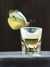
The most important thing in watercolor is to decide early on which areas are going to be white and to be sure to keep these clean. White is not on your palette -- it's on the paper when you start, so you must take care not to lose it. You can mask these areas off or just be very careful not to let them ever get wet. They will be the focal point of the whole composition. In this case, the highlights on the handle are pure white (unpainted paper), and the foam sticking to the glass is close to white (with just a very thin wash).
I start putting the spots on the butterflies with Payne’s Gray. These can be darkened later with Lunar Black, where required. The mug is painted with quinacridone magenta, winsor yellow, phthalo blue (green shade), and Payne’s Gray, starting light and gradually increasing the contrast and color intensity with subsequent washes. This is the advantage of using these stubborn staining pigments – you can go over them repeatedly to increase saturation with disturbing the previous washes much. The effect over time should like a developing photo, with the image starting to appear at low contrast and then gradually becoming more intense. If you go too far, that is if you get too dark, it’s very hard to go back. But not impossible...
For example, I neglected to mask off all the legs of the top butterfly, and consequently I had to dig some of them out from that thick tarry black stuff using a bristle brush. I could not get them all the way back to white, because the phthalo blue in the mix penetrates the paper too deeply. This is why those legs appear blue, and the top antenna is especially dark.
BEFORE:

You can see the botched masking and the soft blue areas where I have worked at scrubbing the black pigment off in the above enlargement. Often a watercolor goes through a difficult period where it seems like it could not possibly work out, but just as often the signs of that struggle is what makes it most interesting. I find that the paintings I had the most trouble with are the ones people seem most attracted to.
AFTER:

So this is the top butterfly again after being laboriously "fixed." I scratched off a few highlights with an x-acto knife, and cleaned the edges of the scrubbed legs and antenna to get a harder edge, where required. I’ve learned the hard way that after distressing the paper in this way (scrubbing or scratching), you cannot wash over it again, because the torn paper fibers suck the paint in undesirable directions via capillary action. But you can very carefully stipple in tiny dots of paint if you freeze them with the hair dryer before they take off in unexpected directions. Experience is the best teacher. Eventually you get a feel for how much abuse your paper will take before it turns back into pulp.
The last steps just involve increasing contrast with repeated washes to increase the reality effect. With staining colors like phthalo blue, winsor yellow, and quinacridone magenta, you can really crank it up. I think people are surprised at the appearance of my watercolors mostly because of this contrast, and because of the depth of the black backgrounds.
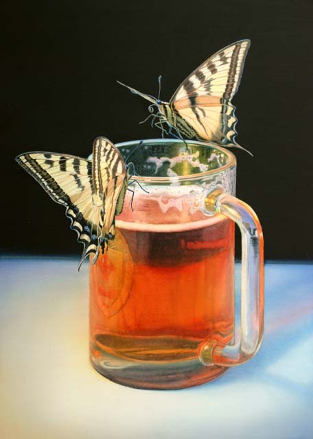
That's it! I'm sorry I did not get to hang this one on the wall very long. I framed it as soon as it was dry, delivered it to a gallery the next day, and it was sold in a heartbeat. So it goes...